Mitchell & Cooper Ltd Brand Identity
Brand identity refresh for a company specialising in design, manufacture and distribution of light catering equipment products for professional use.
Project Overview
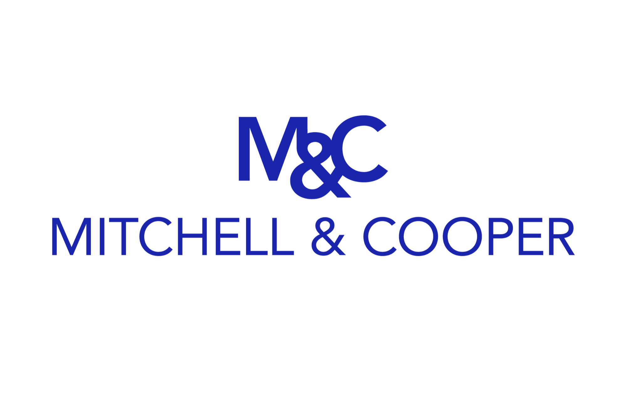
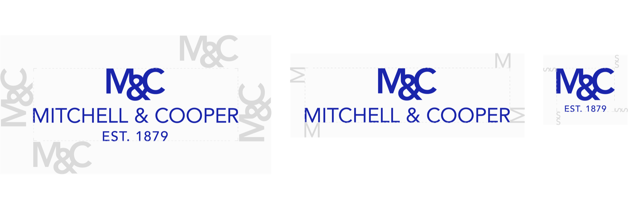
Final Logo Designs
The final logo consists of the ‘M&C’ symbol and wordmark in vibrant blue colour and sans serif font. The three logos comprise one identity.
- The full logo is intended to be used as a stand alone mark.
-
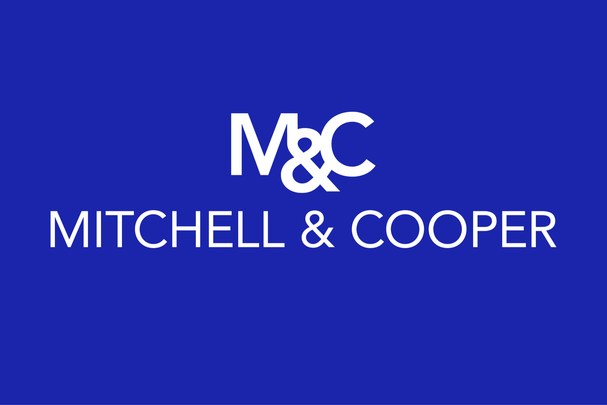
Above Text Logo – to be used when logo is placed directly above text or other artwork for a more balanced composition.
-
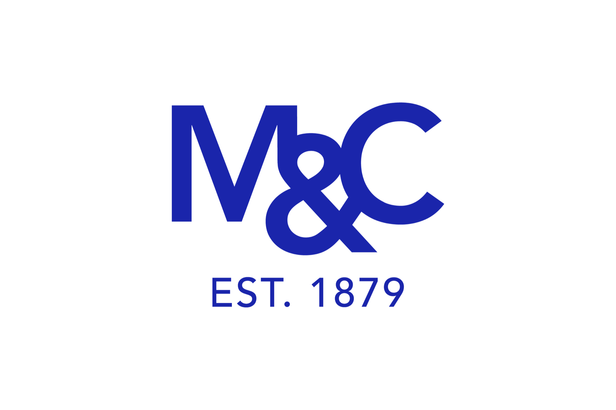
M&C Logomark – offers brand visibility within size constraints. To be used on social media and when space is a constraint.
-
While blue was retained as the brand colour, the addition of red tones make the logo more vibrant and distinguishable even among busy content.
Clear Space
Colour Palette
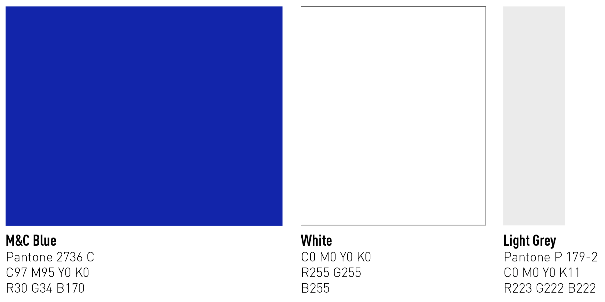
Vibrant Blue and white, with a hint of grey form the colour palette.
- The core brand colour is the M&C Blue which is complimented by White and Light Grey.
- The Light Grey is to be used sparingly.
Typography
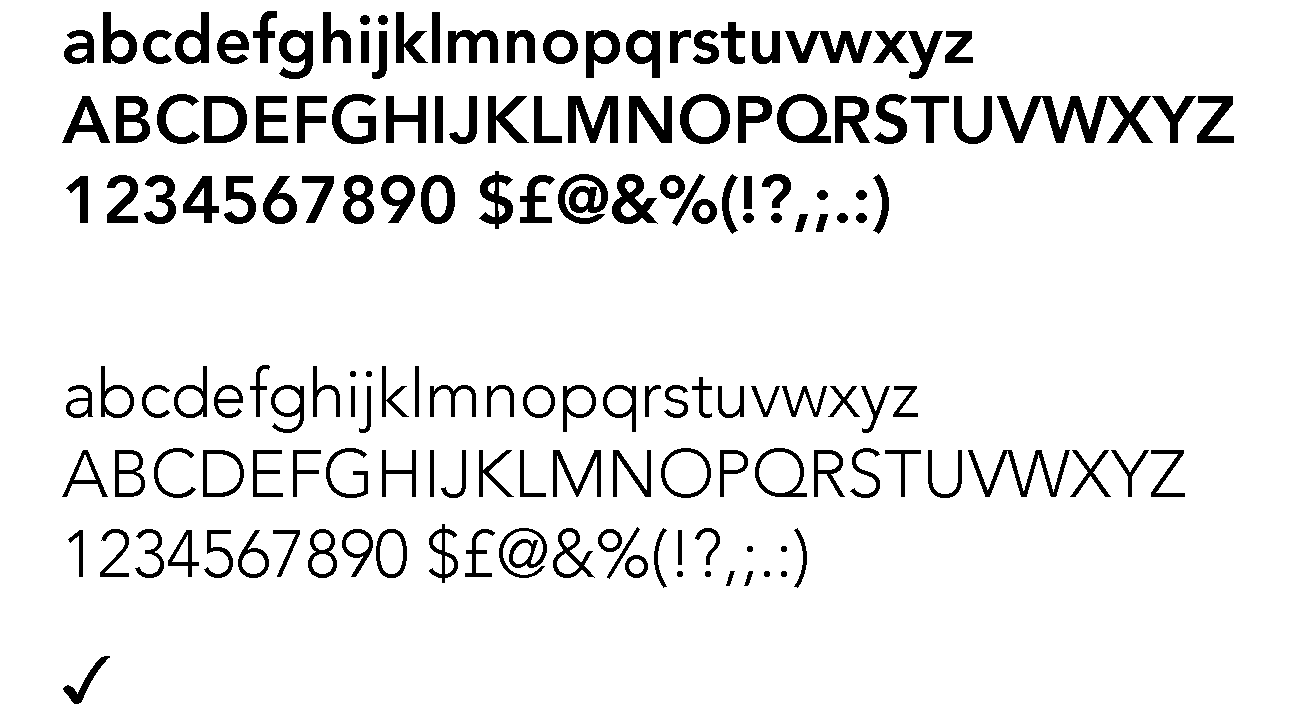
Avenir is the M&C typeface.
- Avenir HEavy – Headers, Titles, Highlights.
- Avenir Light – Sub headers, body copy.
- Unicode 2713 – Checkmark, used in bulleted text.
Legacy Branding
Overview of logos used by the company in the past. From top – logotype and brand colour, to designs used between 1980-2016.

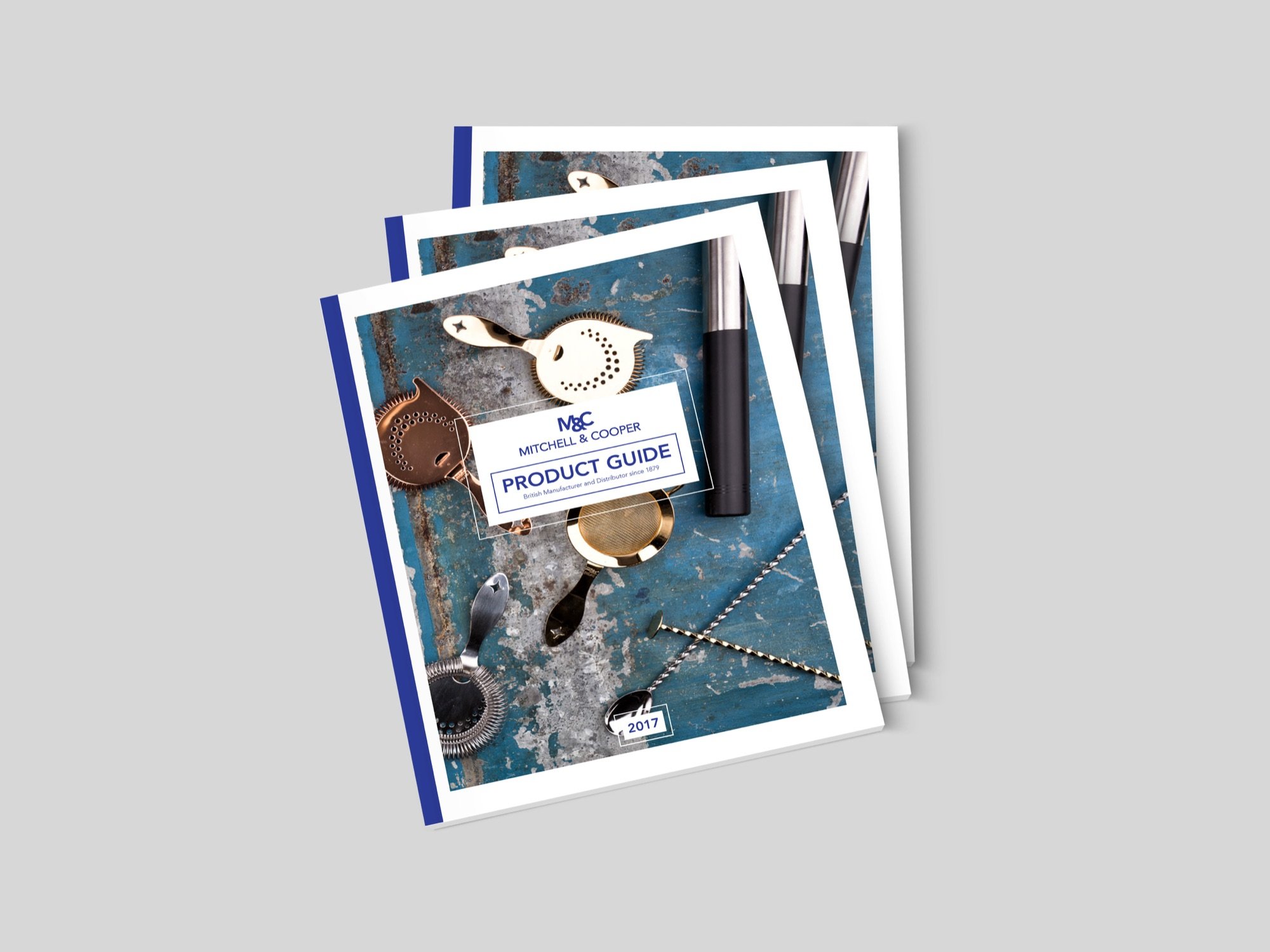
Brand Identity In Use
Framed textboxes, bright and clean photography, light vignettes and textures.
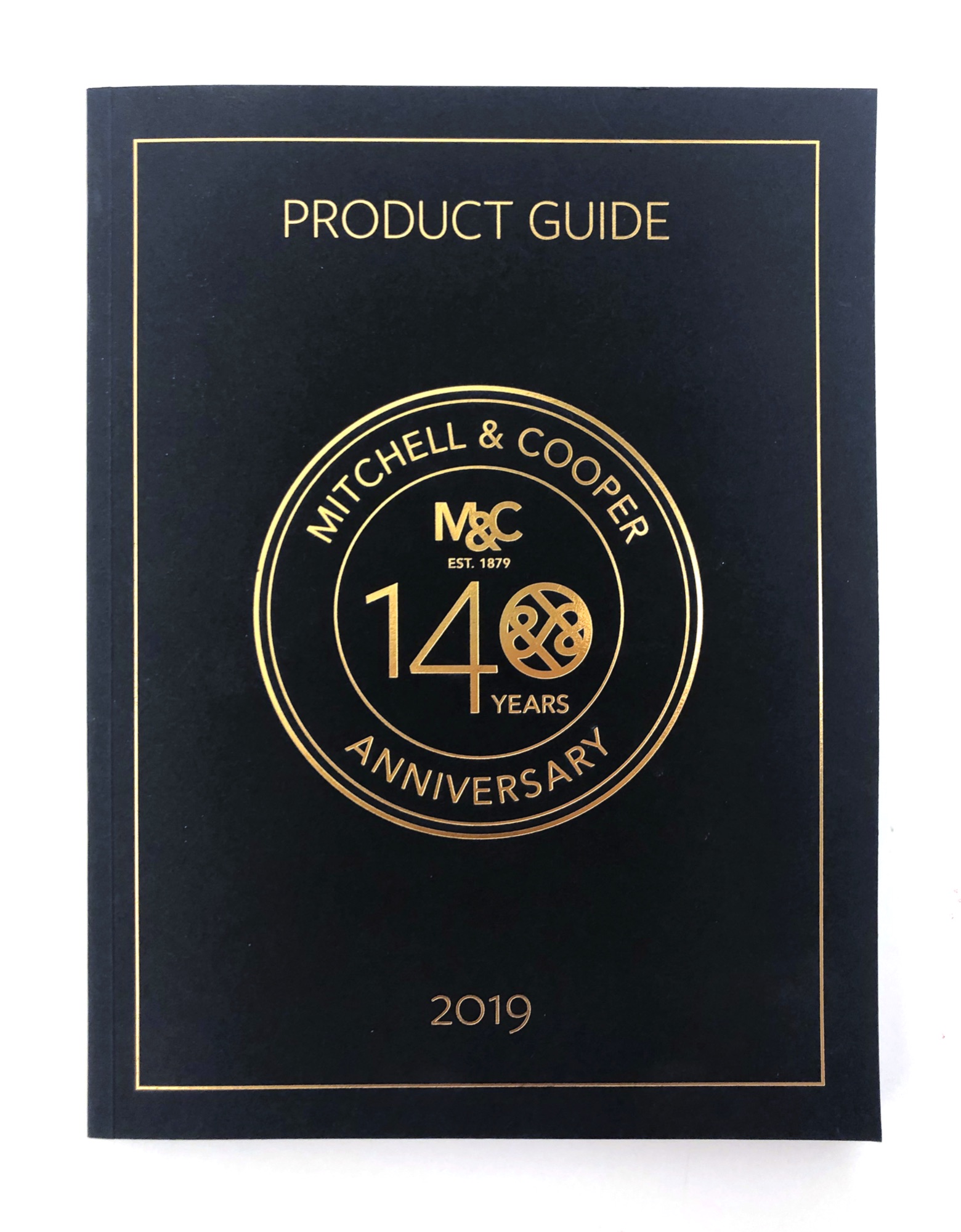
140th Anniversary Branding
The anniversary logo was created to emphasise the long heritage of the company.
- The M&C Logomark grounds the anniversary logo in company’s brand identity.
- Double Ampersand incorporated in the ‘140’ figure intends to bring connotations of the infinity symbol.
- Font pairing –Freight Sans font used in ‘140’ number adds subtlety in combination with Avenir.
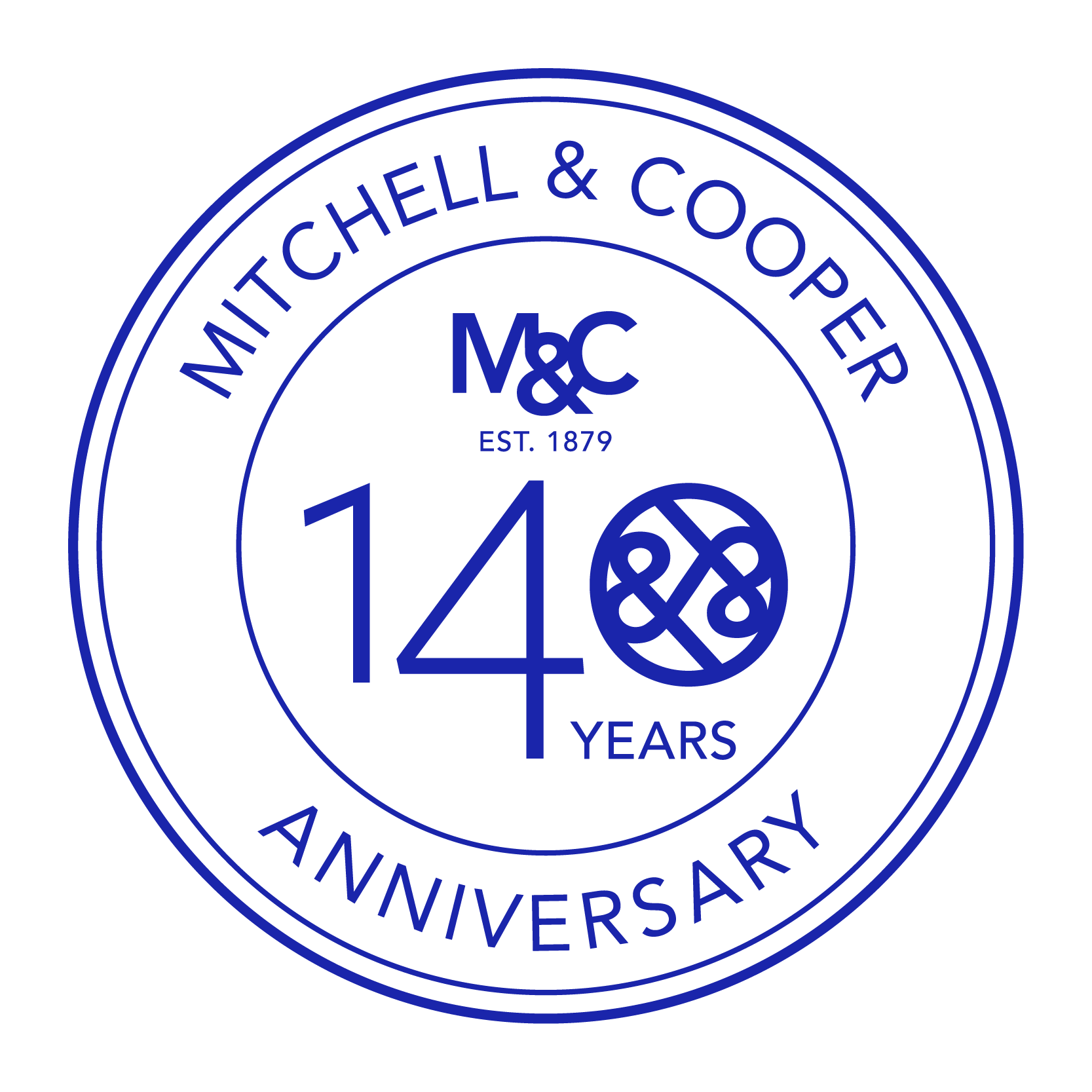
Embossing and gold foil on a rich navy card intend Communicate the rich heritage and quality.
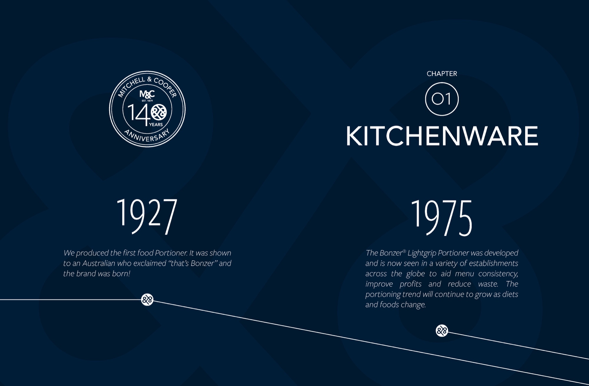
Catalogue’s chapter covers pictured company’s history. The historical timeline’s is also communicated with the linear graphical elements on the pages.